Key takeaways
- Define colours as semantic tokens (canvas, ink, muted), not raw greys.
- Check every text token against every surface for at least 4.5:1 contrast.
- Dark mode needs its own tuned values, not an inverted palette.
- Without colour, state must come from fill, borders, weight, icons and motion.
A monochrome palette looks effortless, but it's easy to get wrong: grey text that's too light to read, borders that vanish in dark mode, buttons and links you can't tell apart, and states that depend on colour nobody can see.
When we redesigned the BreaktroughF1 website in pure greyscale, we treated accessibility as the design brief rather than a final check. This article explains the system we ended up with, the rules behind it and the mistakes we made along the way.
Why greyscale?
Our brand is monochrome. That's a deliberate choice: it puts the focus on typography, layout and the work itself, and it ages well. It also removes the easiest crutch in interface design. Without colour you can't make a button "the blue one" or an error "the red one". Every signal has to be designed.
That constraint turns out to be good for accessibility. Roughly one in twelve men and one in two hundred women have some form of colour vision deficiency. An interface that works in greyscale already works for them.
Start with semantic tokens
The first rule: components never use raw colours. Instead of grey-500, they use tokens that describe their role:
| Token | Role | Light | Dark |
|---|---|---|---|
canvas | Page background | #FAFAFA | #0A0A0A |
surface | Cards and panels | #FFFFFF | #141414 |
raised | Inputs, code blocks, hover fills | #F4F4F5 | #1C1C1C |
ink | Headings and primary text | #0A0A0A | #FAFAFA |
muted | Body copy | #525252 | #A3A3A3 |
subtle | Labels and metadata | #6B6B6B | #8A8A8A |
line | Borders and dividers | #E5E5E5 | #262626 |
line-strong | Inputs and emphasised borders | #D4D4D4 | #383838 |
Semantic tokens have three big advantages:
- Dark mode becomes a token swap. Components don't change; only the values behind the tokens do.
- Intent is readable in code.
text-mutedtells the next developer exactly what the text is for. - Mistakes are rarer. There's no temptation to pick "a slightly lighter grey" for one card, because that token doesn't exist.
We store tokens as RGB channels in CSS custom properties, so they also support opacity modifiers, for example bg-ink/10 for a faint ink-tinted fill.
Test contrast everywhere
Every text token is checked against every surface it can sit on, in both themes. Our targets follow WCAG 2.2 Level AA:
- Body text: at least 4.5:1
- Large text (roughly 24px regular or 19px bold and above): at least 3:1
- Interface components and focus indicators: at least 3:1 against adjacent colours
In the light theme, ink on canvas sits around 19:1, muted around 7.5:1 and subtle, our lightest text token, about 5.1:1. We deliberately don't have a text token lighter than that. If something is too unimportant to meet 4.5:1, it probably shouldn't be on the page.
The trap to avoid is testing only the obvious pairing. subtle text on canvas might pass while subtle text on raised, inside a card, fails. A contrast matrix (every text token against every background) catches these combinations before they ship.
Signal state without colour
Without colour to lean on, every interactive state needs a non-colour signal:
- Fill: active navigation and selected tabs invert to ink on canvas. Chosen options in a form, like the service picker on our contact page, become solid ink with a check icon.
- Borders: hover strengthens the outline from
linetoink; invalid fields get an ink border and ring. - Weight and size: primary actions are solid and heavier; secondary actions are outlined.
- Iconography: checks, arrows and plus/minus glyphs reinforce meaning. The FAQ accordion's plus rotates into a cross when open.
- Text: errors are always written out, never implied by a coloured outline alone.
- Motion: subtle transitions confirm that something changed, and they're disabled when the user prefers reduced motion.
A useful test: take a screenshot of any screen and ask someone which element is selected, which is disabled and which has an error. If they hesitate, the state isn't designed yet.
Focus is a first-class state
Keyboard users depend entirely on the focus indicator. In a greyscale system it's tempting to make focus a faint grey outline that matches the aesthetic, and that's exactly the wrong choice.
Our focus style is a solid 2px ink ring with an offset in the canvas colour. The offset separates the ring from the element, so it stays visible on both light and dark surfaces and on inverted buttons. It only appears for keyboard navigation (:focus-visible), so mouse users never see it flash on click.
Tune dark mode separately
Inverting a light palette produces harsh, glaring text and surfaces with no sense of depth. Dark mode needs its own values:
- Text is softened. Primary text is off-white, and body copy is a mid-light grey, to reduce glare on dark backgrounds.
- Surfaces get lighter as they rise. In light mode, raised elements are slightly darker or lighter than the page; in dark mode, cards and panels are progressively lighter than the canvas so they appear to sit above it.
- Borders are re-tuned. A border that's crisp on white disappears on near-black, so
lineandline-stronghave their own dark values. - Images and logos are checked. Dark logos are inverted in dark mode; photos stay as they are.
We follow the visitor's system preference (prefers-color-scheme) rather than forcing a theme, and the browser's own controls (scrollbars, form inputs) follow along through the color-scheme property.
Typography does the heavy lifting
With colour removed, typography carries the hierarchy:
- a display typeface with tight tracking for headings
- a highly legible text face for body copy, at comfortable sizes and line heights
- a monospaced face for small uppercase labels, metadata and numbers
Two greys in a single heading, ink for the statement and a lighter tone for the qualifier, became a signature of the brand. It adds rhythm without adding colour.
Imagery in a monochrome world
Photography and product screenshots are where colour sneaks back in. Our approach is to show imagery in greyscale by default and let it reveal its original colour on hover, on devices that support hover. The page stays calm, and the work still gets its moment.
How we keep it honest
A design system only stays accessible if it's tested continuously. Before every release we run:
- automated accessibility checks (axe-core) on every page
- layout checks at twelve widths from 320px to 1920px, in light and dark mode
- keyboard walkthroughs of menus, forms and filters
Automated tools catch a lot, but not everything. They can't tell you whether a label makes sense or whether a state change is obvious. Reviews with real people fill that gap.
Lessons learned
- Fewer tokens, stricter rules. Every extra grey is a decision someone has to remember.
- Design the unhappy states first. Errors, empty states and disabled controls are where greyscale systems usually fail.
- Test the combinations, not the swatches. Contrast is a property of pairs, not colours.
- Treat dark mode as a second design, not a filter.
Constraint is a design tool. Removing colour forced every other decision to be deliberate.
If you're building a design system or redesigning a product, we can help. See our web development and design work, read our accessibility statement, or start a conversation.
Frequently asked questions
Can a greyscale palette be accessible?
Yes. With carefully chosen values, greyscale text easily meets WCAG AA contrast. The key is testing each token against every background it appears on.
How do you show state without colour?
Use weight, borders, fills, icons and motion. Colour should never be the only signal — which a greyscale system enforces by design.
How many greys does a design system need?
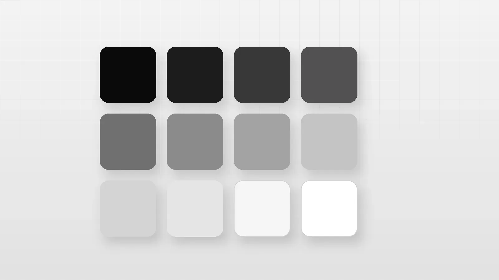
Fewer than you'd think. We use about a dozen semantic tokens per theme: backgrounds, text levels, borders and an inverse set. More shades than that usually means unclear rules, not more flexibility.
Does a greyscale brand work for photos and product imagery?
It can. We show imagery in greyscale by default and let it reveal colour on hover, which keeps pages calm while still letting real work shine.
Written by
Engineering & Design
Notes from the designers and engineers building products at BreaktroughF1: what we learned, what we'd do again and what we'd do differently.